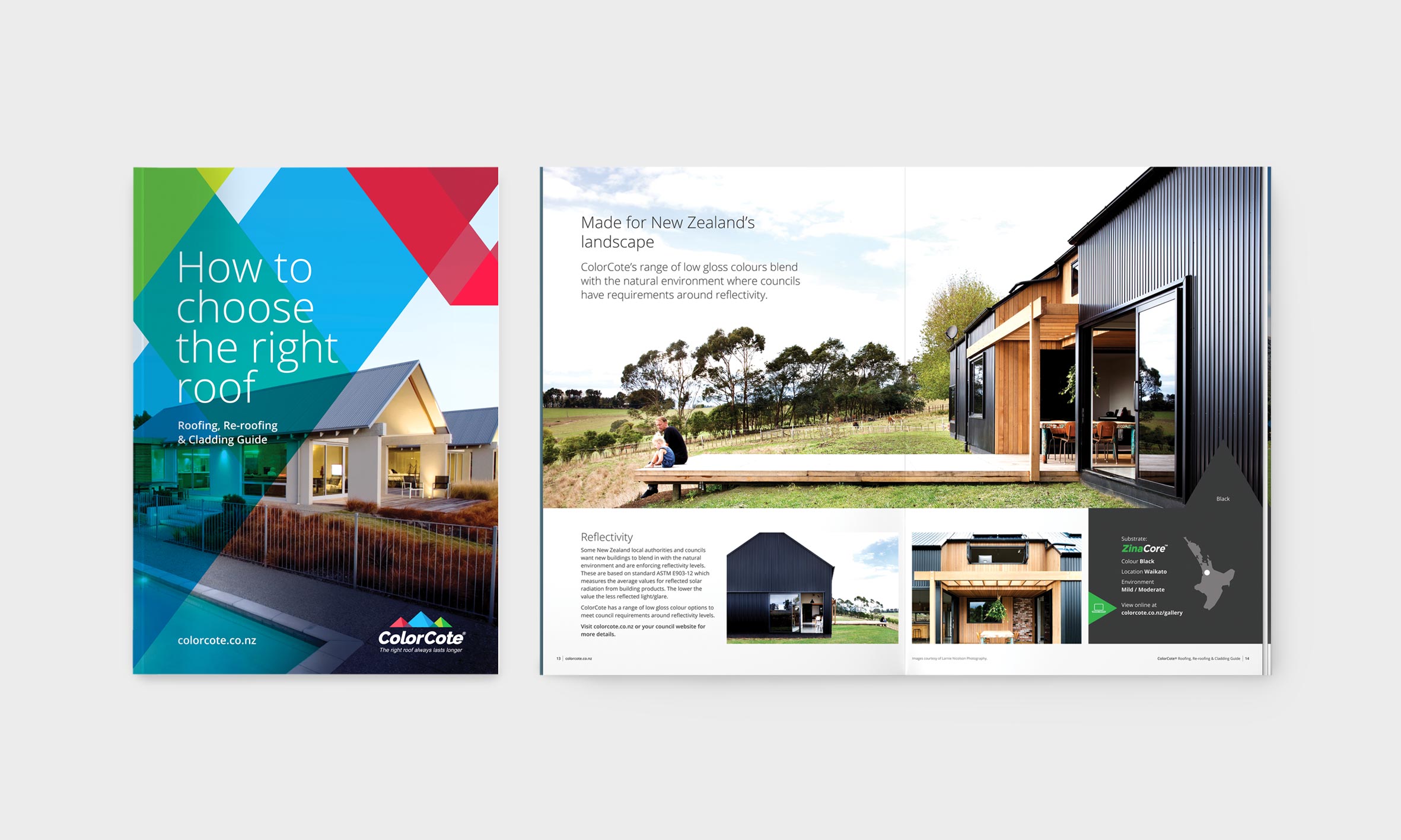
Refreshing a 1970’s brand
A full brand refresh for ColorCote, a company that’s been around since the seventies, required a celebration of its Origin Story and a modernisation of its profile. It was a challenge we were tasked with when ColorCote, leading the way in pre-painted aluminium, steel roofing and cladding products in New Zealand since 1973, approached us.
What we discovered
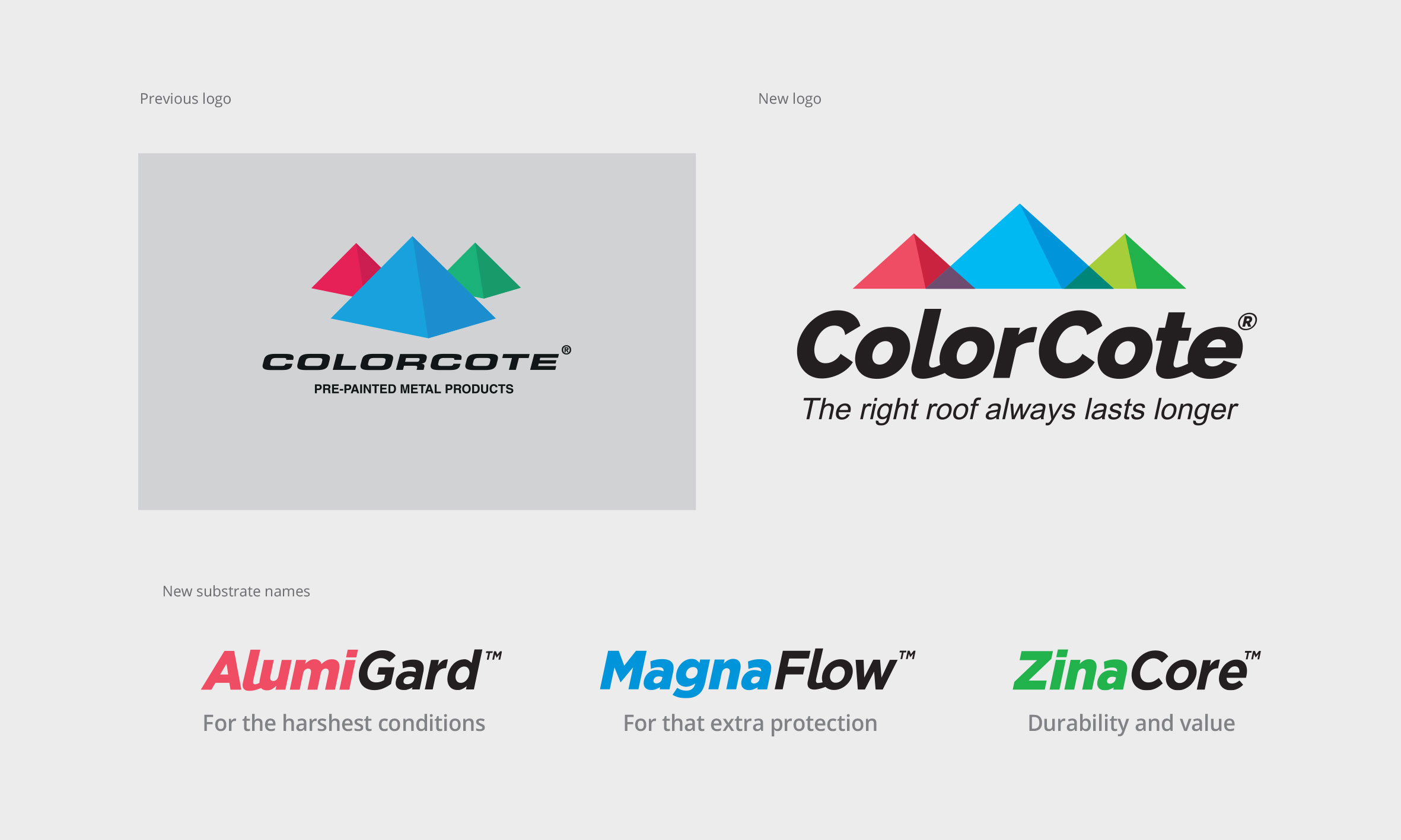
While the ColorCote offering remained steadfast, their image did not. With a story rooted in heritage and steeped in invention, ColorCote should’ve been on the top of their game with a lasting legacy – but they weren’t. Customers weren’t buying it because they weren’t selling it. It all came down to their brand emanating lack-lustre qualities. They needed a brand refresh – their logo was rigid, their messaging was uninspiring, and their graphics were a bit 2002. We also discovered that ColorCote’s largest competitor’s strength was their above-the-line digital marketing efforts – they were owning the space and we needed to fight back.
What we did about it
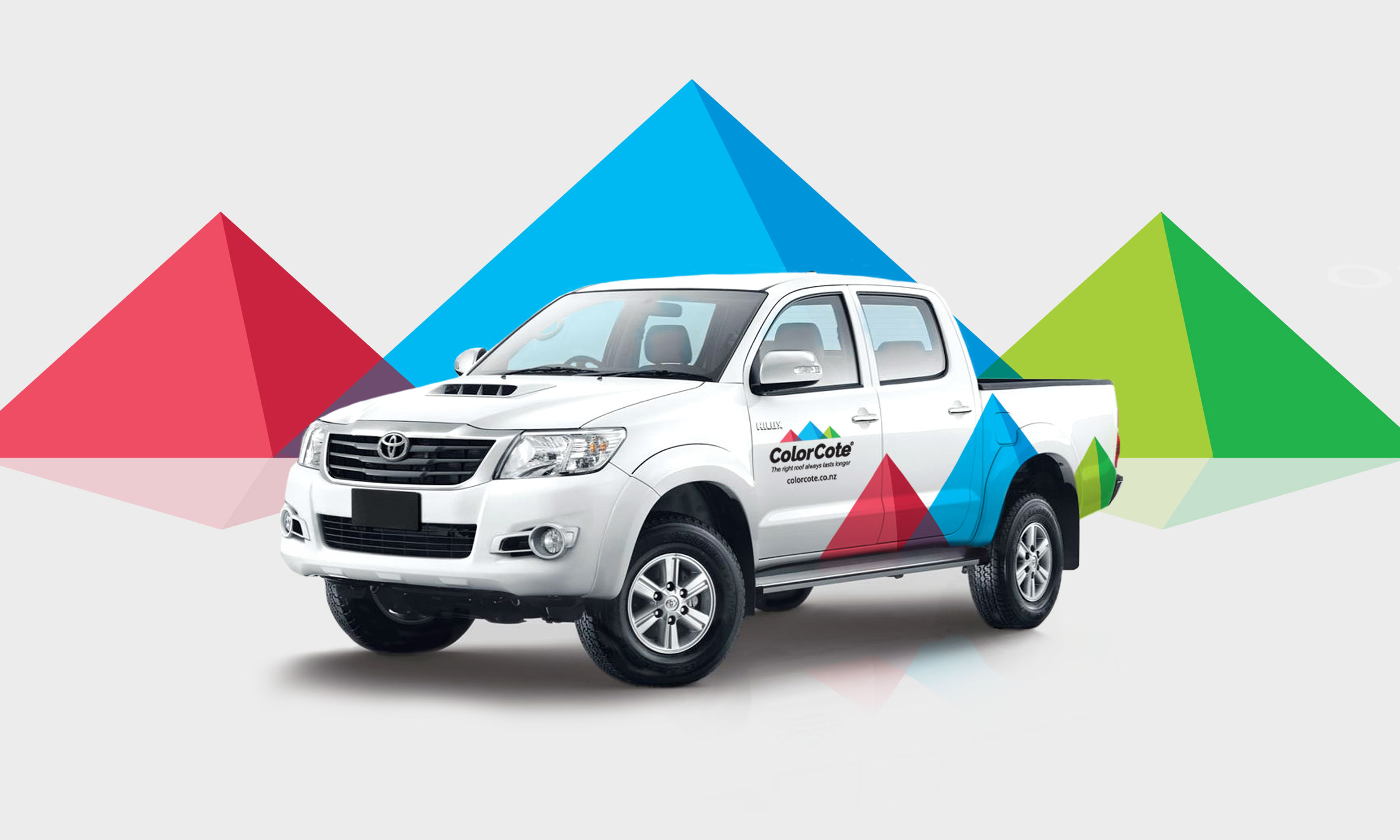
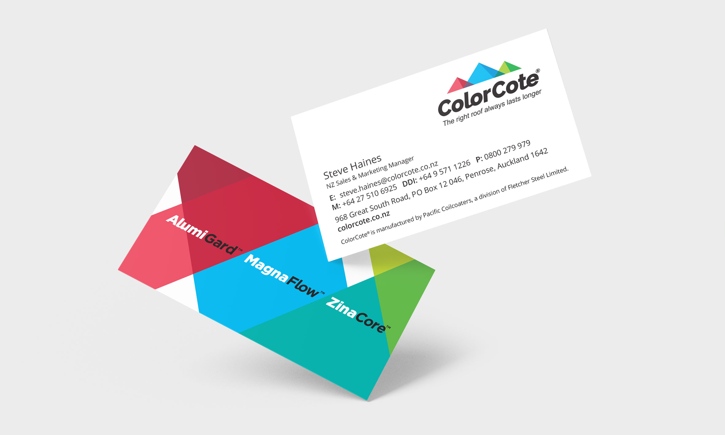
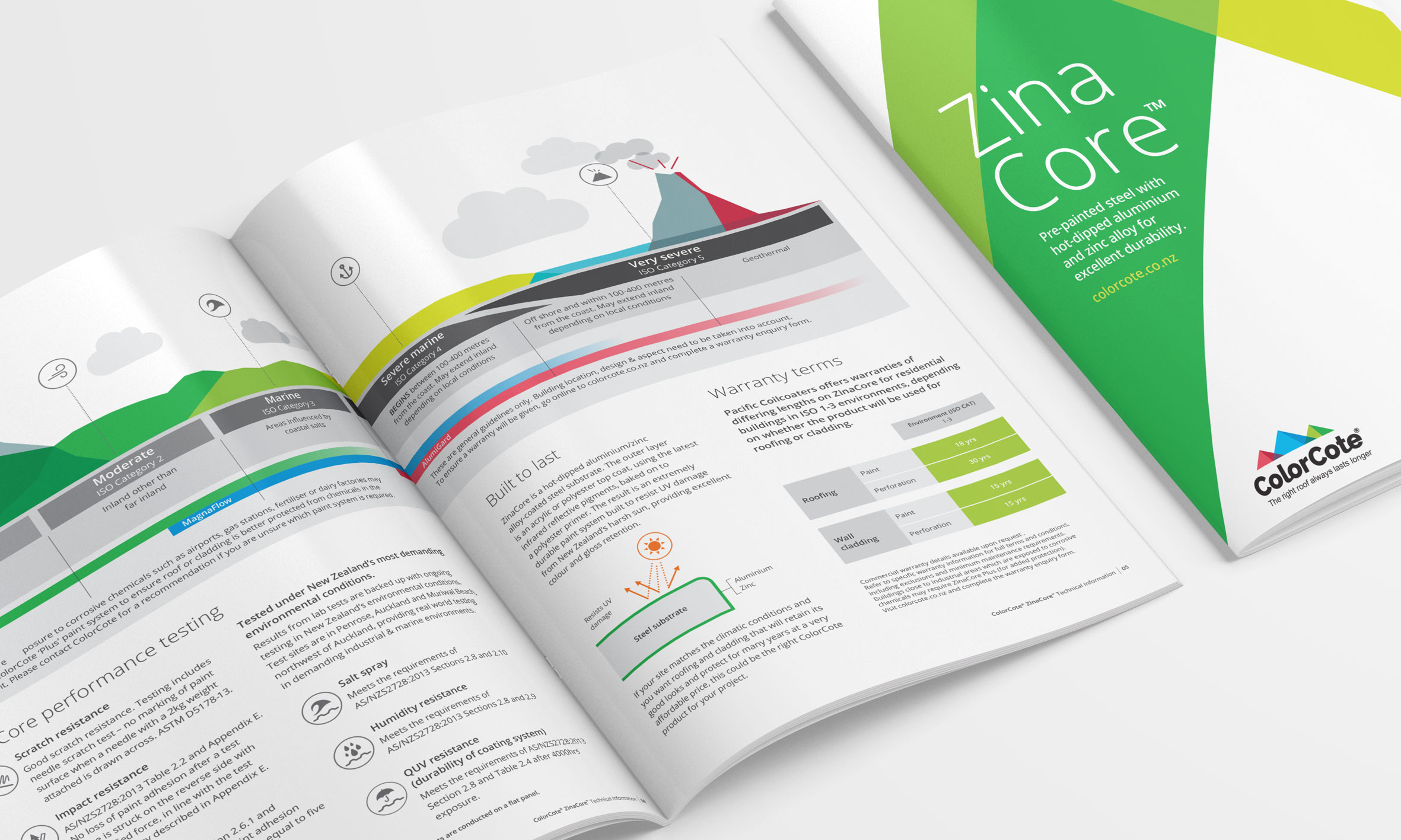
First, we needed to recolour the brand in a way that was more than just cosmetic.

